Getting 'AI Ready' with Textiles
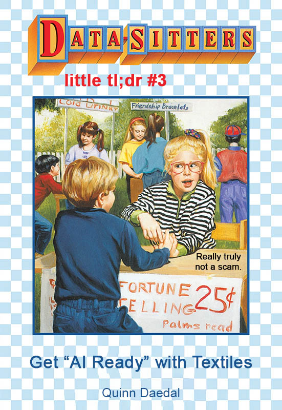
by Quinn Daedal
April 27, 2026
Our main series (DSC) is aimed at people who already know they want to use digital humanities tools. But what if you don’t know if digital humanities is right for you?
Welcome to our spinoff series: Data-Sitters Little TL;DR (short for “too long; didn’t read”), where we offer key ideas and takeaways for people interested in digital humanities but not sure if it’s for them. We’re not here to convert, just to help — all in 1,500 words or less!
Sick of people haranguing you about AI? Frustrated at what ChatGPT has done to your classes, and education in general? Wish you could stab those feelings away? We sure were after DSC #24: Anouk and the AI Surprise!
Here’s what I’m doing about it at Stanford[1].
I teach “Data Visualization with Textiles” – both as a standalone course, and as a one-class drop-in that’s shown up in humanities data science classes, like “DATASCI 156: Thinking and Making with Data” and “ENGLISH 184E: Literary Text Mining”.
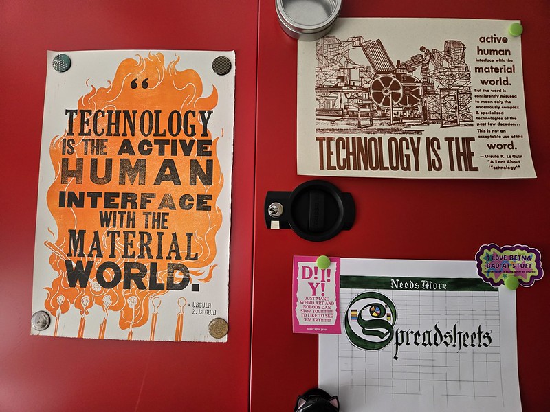
Large language models treat data like an undifferentiated slurry. Throw in more and more of it into this simmering soup, and the results will be “better” – more satisfying, as the output pours forth. But still, all this data that gets boiled off the bones of its origin, context, and the (often subjective) decisions that went into its creation … it means something. What if you make students sit with that, and visualize the data in a slow, careful, thoughtful way? Will that make them think about data differently? Will it make them think about visualization differently?
I think it does. The AI-fueled push of More! More! Faster! alienates students from the data they’re working with. It’s not even that data analysis and visualization is happening on their computer with help from code they may or may not understand (a common problem in some kinds of DH classes), it’s increasingly happening in some black-box AI model where there isn’t even any code for them to puzzle through. So I do the opposite: data is something they hold in their hands. Visualization is something they do with their hands. Different materials and techniques have their own affordances and constraints and challenges – which is no different than the constraints and difficulties inherent to using any piece of software for data visualization, but it’s much more immediate and visible when you’re working with craft methods instead of code libraries.
To be thoughtful and careful users of AI -- or algorithms or technology more broadly -- students need to actually grapple with what data is, what technology is, and what happens when we use technology to transform data into something like a visualization. This is how, at Stanford, we're using textiles and perspectives from digital humanities to get students "AI ready".
The big picture
I want students to think about what data is, and all the (potentially very subjective) choices that go into making a data set. There are some readings, but making students put together data from their life for a week, and discussing with each other the challenges and decisions that went into that data set, has a bigger impact. The next step is to translate that data set into a physical medium. I use textiles, not least because they still require a lot of manual work[2]. This takes a while! But -- as they say -- it's a feature, not a bug. The students really get familiar with the data and its patterns in a way they wouldn't if they could hand it off to a machine. And they come to learn the quirks of the physical materials and the craft practices they're using, in a very real and tangible way. And, conveniently, there's no way to make AI do the project for them. (Anouk chimes in: this is a great example of what we talk about in DSC #24 in relation to getting students to see their work as craft, and taking pride in the skills they're developing.)
Readings
To give an unusual assignment a more legible academic framing, I often use one or more of these readings[3]:
- Johanna Drucker's "Humanities Approaches to Graphical Display", DH Quarterly, vol. 5, no. 1, 2011. Famous for introducing the idea of "capta"; also good for discussion about how the affordances of textiles can address some of the shortcomings of traditional computer-generated visualizations.
- Excerpts from Catherine D'Ignazio & Lauren Klein's Data Feminism, especially Ch. 3 "On Rational, Scientific, Objective Viewpoints from Mythical, Imaginary, Impossible Standpoints", Ch. 4 "What Gets Counted Counts" and Ch. 6 "The Numbers Don't Speak for Themselves", as preparation for students creating their data sets.
- Excerpts from Lauren Klein's Data By Design, especially "Visualization as Argument", on the history of data visualization.
- Excerpts from Giorgia Lupi and Stefanie Posavec's Dear Data, to get students to think about the different kinds of data they might track and creative ways to visualize it.
- Sarah Kendzior's "The Craftsman" (Feb 2025), about craft as an outlet for anger, sadness, and other strong emotions. Popular with students!
Data assignment
You can make the data assignment as open or as structured as you'd like. The most free-form version I've used is: "Create a spreadsheet with at least 10 rows of data drawn from your life this week". A more structured version, from Laura Gorrin's data science class at Berkeley High School, requires at least 20 data points (rows) and at least 4 variables (columns), and invites students to come up with a plan by discussing with their neighbor:
- How will you define what data you are gathering?
- How much data will you need to gather? (Minimum 20 data points)
- In order to gather enough data, how long will you need to gather data: all week, all day, a few hours?
- How will you record your data?
- What variability might you see in your data? (At least four dimensions. For example, time, what I ate, where I ate, how I felt afterwards.)
To complete the assignment, students should submit the data along with a 1-2 page reflection on the process that covers questions like:
- What was the hardest thing about gathering data?
- What did you find most surprising as you gathered data?
- Describe some difficult choices you had to make as you were gathering your data.
- What do you wish you could have done differently as you put together your data set?
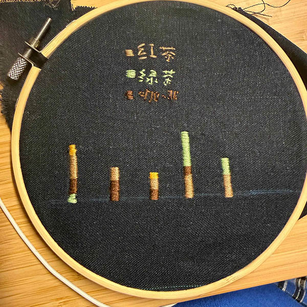
Mapping data to textiles
To take the next step, you can discuss in class some of the different properties of textiles, and how they can be used to represent data. Dear Data is a good starting point for thinking about color, size, shape, and location, but textiles can add other dimensions like texture (smooth/rough, thick/thin), fiber (cotton/wool/acrylic), stitch (e.g. embroidery or knitting), etc. The Data Visualization with Textiles site has many examples and a list of textile properties that students can explore when thinking about how to translate their data into a textile.
Visualization assignment
The visualization assignment can use the earlier data assignment as scaffolding, or you can start here by providing students with an existing data set you want them to work with.
In my "Data Visualization with Textiles" class, students have 10 weeks to learn and practice one or more craft skills. For a one-off assignment, options include:
- Give students a very easy-to-learn craft (e.g. weaving on a frame loom)
- Dedicate an additional class session to teaching a more complex craft (e.g. surface embroidery) that they can use for the project if desired
- Offer an assorted box of general-purpose supplies (different varieties of thread, yarn, and beads, some sticks, maybe a few simple frame looms, crochet hooks, and knitting needles) and let the students sort it out.
Students who already practice a textile craft may want to use that for their project; if you have crochet hooks and knitting needles roughly compatible with the kind of yarn you provide, it can empower students to build on what they already know.
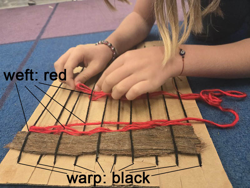
Weaving on a frame loom can be done very simply with recycled cardboard with slits cut across the top and bottom for the warp. The weft can be woven in with plastic yarn needles, or just by hand, going over-under-over-under, and then the opposite on the row below (e.g. if you went over a warp yarn in the row above, go under the next time).
If you're looking for someone to help teach a more complex craft like embroidery, try asking around at campus makerspaces, or inquiring among librarians you work with.
The "grab bag of supplies" approach can be overwhelming for students who have never worked with textiles before. They may have a hard time imagining what they might do. Offering examples like quipu (tying knots) may be helpful as a simple but effective approach.
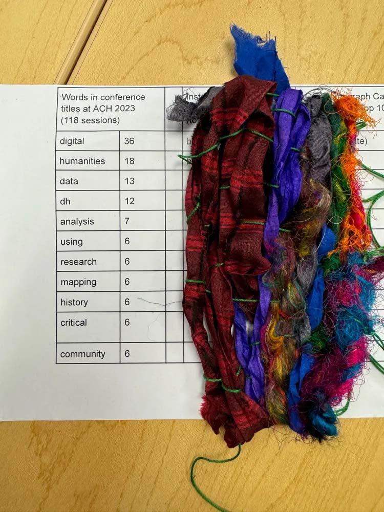
Because it takes time to do this kind of work, encourage students to take the supplies they need home, and finish (or at least wrap up) their project as homework. Have students submit their physical projects along with a brief reflection on what they made, including a walkthrough of how they translated the data into a textile, providing enough information about how it was implemented for you to be able to "read" the object they submitted.
"AI ready!"
Will textile data visualization change how your students engage with AI? Maybe, maybe not. But it offers them a different way to think about and engage with data and visualizations they encounter in the world -- both of which are increasingly AI-entangled. Many students find this hands-on data-craft work joyful and restorative. Maybe you will too. Give it a try and get "AI ready" like we do at Stanford's YarnLab and Textile Makerspace!
Looking for more textile dataviz lessons? DH + Lib has a whole special issue of ideas!
I hate playing the Stanford card. But in a moment where the institutional administrative pressures around AI are high, it may actually be helpful to invoke the name of the ultimate Silicon Valley university to justify an ... unorthodox approach to the topic. ↩︎
There's cool and thoughtful data physicalizations in other media, like Rebecca Sutton Koeser's 3D printing Shakespeare & Company Library membership, and Anouk's plotspaces which represent scalar and spatial shifts in poems using data sculptures, but I think there's real value in the students doing the time-consuming physical work of creating the visualization. (Anouk: when 3D-printed in plastic and resin, a plotspace is pretty quick to make, and milling one from aluminium is much more laborious, but the latter gave rise to some generative reflections on the data, the materials and the labor itself.) ↩︎
If these readings aren't doing it for you, check out the Data Visualization with Textiles bibliography. ↩︎
